Visuals To Remember
As it applies to communication I respond the most to visual communication. Visual communication stands above the rest for me because it not only catches my eye, but it also keeps me focused and interested in whatever is being communicated visually. In addition, visual communication gets the largest response from me because I am interested in the way people communicate messages through their art.
When it comes to visual communication I personally believe the necessary tool are symbols. Symbols stand above type, images, and color in my opinion because symbols allow a message to be translated without using words. symbols ability to quickly get a message out is unmatched in a society where more and more individual's do not want to spend time reading; they want to quickly get the message and move on. symbols allow people to quickly identify companies, products, and even individuals in a matter of seconds proving its ability to convey a message. Without symbols, I believe visual communication becomes nothing more than reading and not the visual communication we are accustomed to today. Mainly, I feel symbols are a necessary tool because they act as reminders to the consumer, a powerful symbol is difficult to forget and when you are communicating through visual communication forgetting is something you do not want the consumer to do.
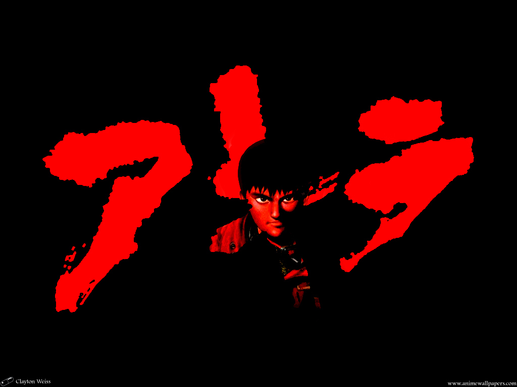
When I think of strong visual communication like most I think of companies like Apple or Microsoft, but on the other hand, I believe there are many other people, brands, and bands that exhibit strong visual communication. The logo(http://images2.fanpop.com/image/photos/13800000/Akira-akira-13822728-1024-768.jpg) for Katsuhiro Otomo anime Akira portrays a level of eagerness or fear due to its bright red color it makes the viewer feel like something is going to happen. The graphic is also written in Japanese calligraphy which shows a level of pride in where Katsuhiro Otomo is from; while also letting the viewer know this is a Japanese product. Like Katsuhiro Otomo's Akira, the Razer computer company's logo projects an emotion. The Razer logo(https://assets.razerzone.com/eeimages/products/24223/performance-blade.png) projects an emotion of the unknown due to its alien like appearance and green color. The triangular shape and vibrant green coloring of the logo acts as a way for Razer to none verbally communicate to the consumer that their product is unlike any they have ever encountered. The green coloring also makes it feel as if the company is signaling the consumer to come towards it; which gives off a welcoming feeling. Lastly, Pharrell Williams' brand, Billionaire Boy Club, space man logo(http://anguerde.com/TTF-243946-billionaire-boys-club.html) portrays a feeling of superiority almost as if being seen with this logo on your clothing sets you apart from everyone else. The space man logos hand gesture acts as a signal to those who wish to buy the clothing because it is the same hand gesture Pharrell Williams is known for doing.
All in all, these three logos share one thing in common they are all memorable, and in visual communication being memorable is key to keeping the consumer interested and engaged.


Comments
Post a Comment